SATURDAY, FEB 27, 2016

Bliss Typography
Bliss for printing information
Eric Lee, A-SOCIATED PRESS
TOPICS: CHARLES K. BLISS, SEMANTOGRAPHY, BLISSMBOLICS, LOGICAL LANGUAGE
"Typography is the art and technique of arranging type to make written language legible, readable, and appealing when displayed. The arrangement of type involves selecting...line length, line-spacing (leading), letter-spacing (tracking), and adjusting the space within letters pairs (kerning)."
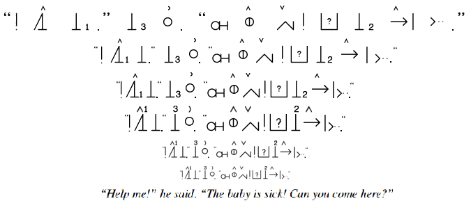
TUCSON (A-P) — Promoters tend to ignore "downsides" as it detracts from overselling and compared to ASCII text, Bliss is not always just unimaginably so much better in every way. BCI (Blissymbolics Communication International) has Bliss fonts showing full sized symbols mixed with equal height text. If inline text is 12 pt and is 1/2 height as currently specified by BCI, a full sized Bliss symbol is 24 pt. But Bliss minimally claims 12 pt of space below for half height symbols to be used as descenders to depict underground things like roots and groundwater. The below groundline space is not often used but is used and needed.

Bliss also minimally uses another 12 pt of space above the mainline area for indicators and occasionally half-height symbols, especially the "mind" symbol. So minimally, compared to 12 pt text, Bliss uses a 48 pt area assuming no line spacing and that indicators are superimposed on ascenders. Normal text does use line spacing, so a 12 pt font uses 14 pt to 17 pt of space, or 1/3 the height. Bliss leaves the "sky" area and "ground" area free for occasional use and printing without line spacing is reasonable as a descender would rarely touch an indicator in a line below and meaning would not be affected if it did. Given that Bliss minimally uses more paper than text, adding leading to eliminate a descender touching an indicator, even 105% leading, may be excessive.
BCI, however, adds space below descends to use for pointers so if you wanted to point up at a root to indicate the tip of the root you can, and space is added above so if the "mind" indicator is used, another indicator can be put above it. The effect is that 25% more vertical space is added. So to use 12 pt text, BCI Bliss uses 72 pt lines with no leading.
If Bliss is envisioned only for therapeutic use, then saving paper is an irrelevant consideration. If used only on computer screens, even more irrelevant. If books or even term papers are printed in Bliss, the space needed does matter. Term papers are printed double spaced. Bliss is more horizontally compressed than text. So Bliss uses about the same number of pages as double spaced text.
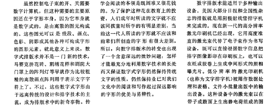
Proponents of Chinese writing often compare an few logographs, each made to fit in a little invisible box with no space between them, to the long string of alphanumeric characters used to translate it and claim that writing in Chinese "saves paper." Chinese words are compact, but why? Why no space between? One logograph can actually touch another. Why are margins in Chinese books smaller? Why are Chinese books printed on bigger pages? Why are the characters printed so small that detailed strokes within many ideographs cannot be seen, are blurred in print? Why do English books translated to Chinese require about 12% more pages? The question could be why do they require only 12% more pages? Chinese, even with all the space saving compromises, uses about 12% more pages.
In Chinese there is no indicator area above, nor room below for occasional descending symbols. The ideographs tend to be very compact and detail dense, but there is significant line spacing to make empty space between lines. Ideographs represent ideas semi-pictorially, and that takes more space than representing the sounds that represent the ideas. English often uses several letters to represent one sound and could be more compact than it is.

Bliss, compared to Chinese, makes extravagant use of space to maximize readability. Language books for children do the same and Bliss has no adult literature. In Bliss there is not only a lot of blank space between lines, but a full space is used between each ideograph (Chinese uses 0 space). The BCI convention of using 1/4 sized indicators requires printing in a 25% larger size overall and uses 25% more vertical space to maximize readability for children. Charles Bliss often compared Bliss to Chinese favorably, but never compared his system to Chinese typography.
If Bliss is to be used for practical purposes, other than therapeutic, it will evolve to become more like Chinese. Readers will tolerate less space between ideographs. Although indicators are used above and descenders are used, Bliss needs no line spacing. Chinese has empty space between lines and Bliss has mostly empty space that is occasionally put to good use, so while Bliss uses more vertical space to write in it uses all available space. Original Bliss will use about 225% more space than English or with just smaller spacing between ideographs, 170%. If it were to be compacted like Chinese, 120% might be possible.

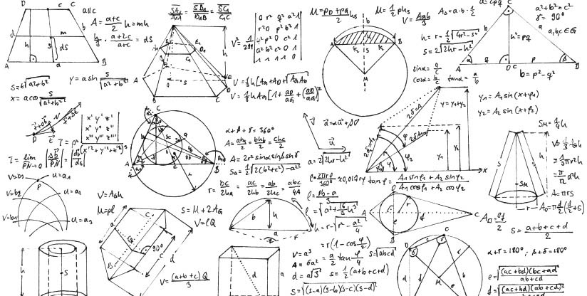
So Bliss and Chinese don't save paper. If we evolve into a paperless society, it won't matter. Still, if printed as hard copy, is the "waste" of material a deal breaker? If so, then all diagrammatic languages, including mathematics, should be dispensed with and written in strings of arbitrary (with respect to ideas) letters that merely indicate the sounds a talking head using one of thousands of spoken languages is making. Why write 2+5=7 when you can write "two plus five equals seven" or watch a video of someone saying it? Arithmetic is more compact, but higher math involves diagrams that are not so linear nor compact. The use of space is a price of writing diagrammatically.

Bliss is more horizontally compressed than text by about 25% to 50%, but takes about 250% more height, so uses about twice as much space. So if printed on paper in Bliss a 100 page book of text only would be 200 pages of ideographic writing. Bliss is about the same as printing text double spaced, so a term paper printed in Bliss would be equivalent to one printed double spaced, meaning there would be room for notes. Not such a bad thing for scholars, but for general reading, printing in Bliss will use more paper. On a computer screen there is little concern over wasting pixels, but if printed on sheets of gold or paper, a Bliss book will cost more. Compacted but still readable Bliss might use just a little more.
The BCI convention of adding 25% more space to allow for putting indicators on top of indicators and pointers below any descending symbols so as to point up to them if that should ever be desired is excessive for practical purposes. Bliss already has a serious issue wasting paper and wasting 25% more for some rarely used and never needed option is excessive. On screen, maybe not an issue, but printing happens.

