SATURDAY, FEB 27, 2016

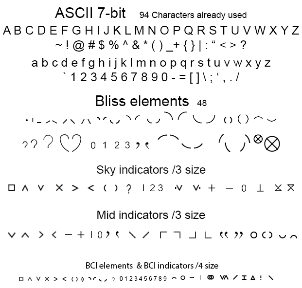
Bliss Character Elements
Conceptual parts
Eric Lee, A-SOCIATED PRESS
TOPICS: CHARLES K. BLISS, SEMANTOGRAPHY, BLISSMBOLICS, LOGICAL LANGUAGE
TUCSON (A-P) — The conceptual starting point: Shape + Orientation + Size.
Shapes + Orientation in English:
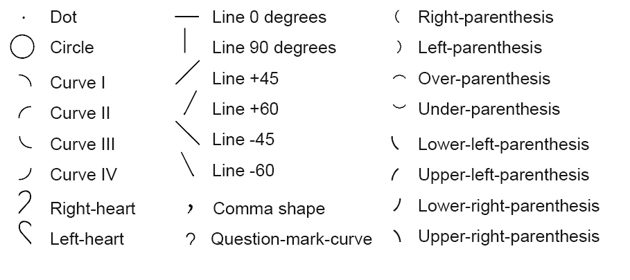
These are all the shapes of Bliss. They may come is several sizes, but shape and orientation remain fixed. A line 0 would have no slope and be horizontal. A line 90 would be vertical, and a +45 would have a positive upward slope (/) of 45 degrees. A -60 would have a 60 degree line with a negative down slope (\), and so on.
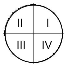 Traditionally the quadrants of a circle start with number 1 in upper right and are numbered counter-clockwise. Each curve is a quarter section or 90 degree section of a circle. The other curve used is a 120 degree section, upper, right, lower, left, of a circle which is the shape of a parenthesis. The question mark curve is only used to make question marks by adding a dot, but it is, along with dot, a needed elemental shape.
Size:
1/4
1/3
1/2
1/1 or full
Full size is the height of the main line area ideographs are written in. Most indicators go in the "sky" area above them. Rarely a 1/2 height ideograph (the one for "mind" mostly or perhaps stem of fruit) is used as an indicator. The sky is half height. Occasionally 1/2 height ideographs go below the main line area and so are half height.
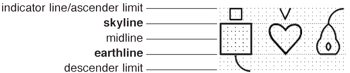
The large box is "full size:" The total writing area is equivalent to two full size areas. ASCII characters can be used with Bliss and are 1/2 height or 3/4 height when printed small so inline text is as readable. This means that each line of Bliss takes up about the same space as two to three lines of text. Bliss writing is taller but takes less horizontal space. Still, a 200 page textbook with some illustrations might be 220 to 300 pages written in Bliss. If you were writing Bliss on clay tablets, you'd need more clay.
Needing more area to write readable ideographs on is a downside, but not a deal breaker. To minimize wasted space, no line spacing is used so it is conceivably possible that a descender could touch the top of an indicator in the line below. At some point this will actually happen, but other than the distraction of noticing, no confusion in meaning will be involved. The area under the main area is under the "ground" line. The main line area could be called the surface area as in surface of earth between sky and ground. If writing about groundwater the water symbol can be written under the ground line, but adding extra space to eliminate the possibility of contact would be excessive in terms of practical purposes.
For practical book printing purposes the second to last line of Bliss would mix well with the ASCII text as shown printed at 3/4 height as both are about equally readable. The last Bliss line would be for the small print. In the fully expanded style of the first line, Bliss books would likely use six times more paper than ASCII text, but optimized to print a book or magazine in Bliss might use about the same amount of paper or clay. For durability, don't write on paper or wood. Clay, animal bones, rock, and turtle shells last longer, though gold sheets would last underwater. Repurposing aluminum cans has potential and are currently more common than animal bone or shell. A 24-pin dot matrix printer could print Bliss on aluminum. Saving information for posterity may not be of interest as it is merely about the long-run bottomline and not next quarter's bottomline or pay check.