TUESDAY, FEB 23, 2016

BCI Bliss
Bliss for special needs children
Eric Lee, A-SOCIATED PRESS
TOPICS: CHARLES K. BLISS, SEMANTOGRAPHY, BLISSMBOLICS, LOGICAL LANGUAGE
"Blissymbolics Communication International is a non-profit, charitable organization that holds the perpetual, worldwide rights for the use and publication of Blissymbols."
TUCSON (A-P) — BCI acquired ownership from Charles K. Bliss in 1975 for therapeutic use to help persons with severe speech and physical impairments. In 1977 Bliss claimed that this agreement was violated, that he was deprived of effective control of his symbol system. Bliss came to seek legal redress in 1982 and reached a settlement. He was old, used the money received to print copies of “Blissymbols Picture Book,” and died "heartbroken" three years later.
Those whose interest in Blissymbolics is therapeutic should stop reading. Under no circumstances should anyone interested in teaching BCI Bliss, developing proprietary supporting materials, or learning and using it, should consider any other form of Bliss, including CK Bliss as Charles K. Bliss developed and described it in Blissymbolics: A logical language for an illogical world. Only BCI Bliss, as developed for therapeutic use, need be considered. Every single change made by BCI was made for therapeutic reasons, was necessary, and should not be altered in anyway. Bliss is not a money-making opportunity apart from working under BCI approval. Charles K. Bliss was not approved, nor are the Friends of Bliss.
A major change to original Bliss had to do with "interpretation" and "proportion," or readability and use for printing books. Basically BCI needed to develop Bliss for use by their target market, largely special needs children. For children, readability is maximized. Typographical considerations for making Bliss practical for printing books for adults to use for international communication is irrelevant. The goal of universal communication differs from optimizing for therapeutic use with children, and with BCI Bliss, disabled children win. In BCI Bliss words are big with plenty of empty space. Saving paper is irrelevant.
In original CK Bliss (as C.K. Bliss designed it), main characters are twice the height of ASCII characters and may descend below a "ground" line, and ascend into the "sky" area, both being half the height of a full sized character, so total height is two main characters or four times the height of ASCII text without line spacing. C.K. Bliss did use the "mind" character as an indicator in the skyline and added indicators above it. BCI Bliss adds extra space below so that a line of BCI Bliss is six times higher than ASCII text. If 12 pt text is considered minimally readable, BCI Bliss would have to take up 72 pt of space compared to CK Bliss which would use 60 pt of space on paper. All forms of Bliss will use more paper than ASCII text. This is an issue and BCI Bliss maximizes space and paper use. BCI is almost exclusively used via screen so paper waste is irrelevant.
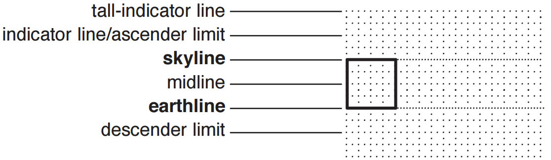
CK Bliss goes down to the descender limit but not beyond, and up to the indicator/ascender limit but not above. CK Bliss, unlike ASCII text or Hanzi Chinese, requires no added line spacing. A BCI rule is that compound words should not be more than three full character widths wide plus separating space, perhaps a therapeutic consideration. Avoiding single characters more than three wide is doable, but not a rule in CK Bliss.
BCI Bliss allows pointers below descenders and indicators above ascenders as did C.K. Bliss. This avoids being limited to pointing from the side or superimposing an indicator, both extremely rare situations which could be avoided, but to maximize readability and avoid limiting use by disabled children, BCI allows and requires maximum space.
Alternative is to not allow pointing up at a descender and allow superimposing indicators to reduce paper use 25%.

 It is possible to find examples in CK Bliss, as shown in Semantography, where indicators are small, really small. The book was self-published and Bliss characters were hand drawn and shown five times larger than intended when typeset. He also tended to use a typewriter to make numbers that should be half height but appear much smaller. An indicator shown proportionally smaller than it should be was not an issue.
  Other examples (many) that more care was taken to be proportional, show indicators as almost half the size of a full sized symbol. BCI Bliss uses 1/4 sized indicators. They are readable at the size (large) that BCI Bliss is displayed for children. They become hard to read on paper when indicators take up 1/4 the space of ASCII characters. Alternative to going full-half-quarter sized is to go full-half-third sized. Third sized indicators are a bit less than many CK Bliss examples, but match many examples, and 1/3 is more logical than 1/2.6 or other size between 1/3 and 1/2. Proportionally larger indicators allow Bliss to be printed smaller to save paper and still be readable. There is no downside to making them bigger, so consider CK Bliss as using 1/3 sized indicators.
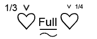
ASCII text can be mixed with Bliss at 1/2 full Bliss character height. Zoom out until "Full" is still okay readable. The 1/3 is still readable. In CK Bliss, readability is important when printed small for practical purposes.
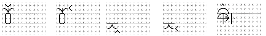
 In BCI Bliss the question mark indicator is 1/4 sized in height and 1/8 width. In CK Bliss the upper part is 1/3 height and width. The dot is considered as added, so it is nearly twice the size and twice as readable.
Other differences are minor. A 1/4 sized circle is added as an indicator in BCI Bliss and two are combined to create the "combine indicator" used to indicate that someone is combining Bliss symbols to create a word in a way that BCI has not yet approved. In CK Bliss it is not needed.
 BCI uses the 1/4 sized parentheses to indicate "pit" as seed inside a pictographic fruit. The left 1/4 parenthesis is used to indicate "hair" and a 1/4 over parenthesis indicates claws as on a cat or raptor. For children, creating ideographs that are as pictographic as possible is important.
Only a few examples exist showing BCI Bliss mixed in with ASCII text. The impression is that it is printed at the same size. It can be, but if the text is marginally readable, the Bliss characters are less than readable.
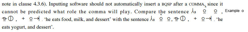
Note small (half height) circles and full sized circle. Note that they are larger than the "o" in the added 1/2 height "Example o" text. Note under the comma in "COMMA" there is an indicator offset to the left to avoid overprinting the comma. Note that there could be an indicator above that would print in the middle of the characters above it as could be the case if there were any descenders. If printing books in Bliss, this would be an issue requiring the text to be double spaced.
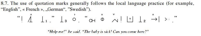
The quotes shown are ASCII, not BCI Bliss. As shown, the wide spacing between characters and height requires much more space, about 6x, than ASCII. Current convention is to put a full space between Bliss words, a quarter space between between symbols within a word, and 1/2 space before or after punctuation marks. Chinese (Hanzi) has evolved to avoid wasting paper only recently considered too cheap to matter.
Books translated into Chinese tend to require about 12% more pages than when written in ASCII. This is true dispite using little or no spaces between characters and printing really small given that the characters average 12 strokes and can have up to 64 really little brush strokes. Bliss requires no line spacing and can be compressed horizontally. Bliss will likely develop to become more like sinographs.
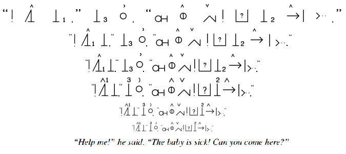
The first line is from the BCI site. In the second line separating spaces are halved and Bliss sized quotes are used. In the third, spaces are halved again. The forth line is FoBliss. The fifth line is FoBliss reduced 33%. Bliss requires the option of including ASCII text within lines. At this size, the Bliss is readable but the ASCII text would difficult to read. The sixth line is reduced 50% and the bliss is difficult to read. If text were inline, it would be less so. Half sized text becomes limiting and text is used and needed. For example all Latin names for organisms will not get ideograms. Groups, like felines, get ideographs, and a few sub-groups too, but to specify a species, the Latin name would be inserted in ASCII. The question arrises as to why ASCII is 1/2 sized. An option is to insert ASCII names at 3/4 size. This allows Bliss to be printed smaller as the text is still readable and far less paper wasted if printed. The text line above and the next to last line of Bliss would go together as 3/4 text to full size Bliss with neither being "too small." Specifying 3/4 text is a practical option when printing Bliss. FoBliss uses both 3/4 and 1/2 sized ASCII fonts and characters in addition to 1/3 sized indicators. The indicators are small but few and occasional, so are readable though relatively small.
The only difference with CK Bliss is the numbers used as indicators are moved to the indicator line, though they could also go in original positions. The only difference with BCI Bliss, apart from spacing, is use of 1/3 sized indicators and option to use 3/4 sized text. Zoom out and note the difference. This is still spacious compared Hanzi. Bliss, as a living system, like Hanzi has over thousands of years and is continueing to, will evolve. Change may be, but is not always for the worse.